家居装修知识网
2017米兰设计周 | 发现如恩
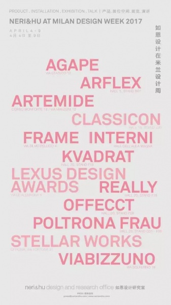
产品设计 展位空间 展览 演讲
PRODUCT . INSTALLATION . EXHIBIITION . TALK
2017年4月4日至9日 米兰 Salone Del Mobile
April 4-9, 2017 Salone Del Mobile, Milan
产品设计 PRODUCT
NERI&HU X AGAPE
VIA STATUTO 12
IMMERSION 浴缸
IMMERSION BATHTUB
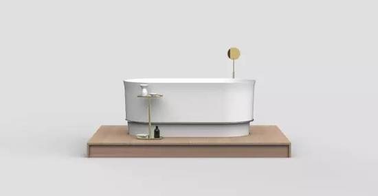
关注着与日俱增的全球城市密度,如恩设计致力于为城市居民所面临的日益狭窄的生存空间提供解决方案。Immersion浴缸的设计灵感源自日本和中国使用的传统木质浴盆,与标准的浴缸相比更深,同时占用更少的地面面积。和泡温泉的体验类似,使用者在浴缸中更多采用坐立而非斜躺的姿势,但浴缸的深度能够让身体完全被水覆盖,让人在享受放松的同时可享受从水面升腾而出的蒸汽。浴缸的设计采用最精简的轮廓与线条,实现了优雅的比例,营造独特奢华的沐浴体验。
Observing the growing density of cities across the globe,Neri&Hu’s design addresses the increasingly confined living spaces thaturban dwellers are confronted with. The Immersion bathtub, inspired bytraditional timber bathing vessels used in Japan and China, is deeper than astandard tub and occupies a smaller footprint. Similar to an onsen hot springexperience, the posture of bathing is more upright rather than reclined, butthe added depth allows a full immersion of the entire body for deep relaxation,while also enjoying the steam as it rises off the water surface. The resultingdesign features minimal lines, maintains elegant proportions and offers aunique and luxurious bathing experience.
NERI&HU X ARFLEX
HALL 5, STAND B07
“摇篮” 沙发
CRADLE SOFA
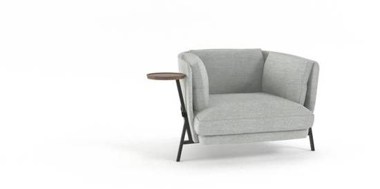
Arflex自创立之初就一直致力于与建筑师的合作。在受邀为品牌设计一款扶手椅时,如恩很自然地选择从 构造的角度入手。因此,设计概念源于沙发的结构本身,采用经典的三角形并以通过多次重复制造出有趣的形态。串联着的皮带加固了沙发结构,也支撑着布面的靠背和坐垫,包围成摇篮的形状。这件家具继承 了这一意大利品牌一贯使用粗犷风格,也融入了对结构的现代主义表达。与遮盖沙发结构从而营造漂浮感 的手法相比,Cradle沙发选择将支撑结构暴露出来,极尽彰显精致的做工与优雅的细节。
Since its inception, a core value of the Arflex brand has been its design collaborations with architects. When architects Neri&Hu were approached to design an armchair, there was a natural desire to place emphasis on the tectonic aspect. As such, the genesis of the design concept is the structure itself, a classic triangulated construction that is repeated several times around the chair. Along with a leather strap fastened between the structures, a cradle is formed, which holds the fabric shell and soft cushions of the armchair. The piece draws both from the rich lineage of Italian furniture, known for its bold sculptural shapes, as well as from the modernist sensibility that demands an honest structural expression. Rather than conceal the framework and attempt to make the chair levitate off the ground, the elegantly crafted supporting elements themselves become the highlight of the piece.
NERI&HU X ARTEMIDE
CORSO MONFORTE 19/VIA MANZONI 12
“燕子”灯
YANZI LIGHT
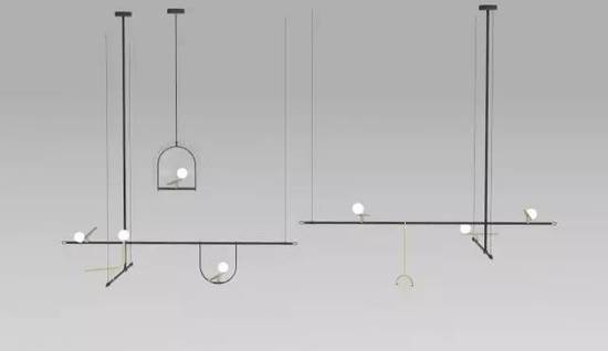
如恩为Artemide设计了极富诗意的“燕子”系列灯具,以诗情画意淋漓演绎了Artemide “TheHuman Light”的品牌理念。这款灯具凝练了上海市井生活中的平常情景,捕捉了鸟儿在枝杈上休憩或在竹笼中啁啾的动人画面。该系列包括吊灯、落地灯和台灯,由黑色的支架和拉丝黄铜制成的“燕子”组合而成。可调节的轨道系统和灵活的组合功能为这一系列的灯具赋予了无限可能。这些静态的“燕子”有着优雅的线条和极简的外形,散发出奇特的生气,表达出设计师对城市和自然的敬意,充满无限趣味。
Adopting Artemide’s guiding philosophy of “The Human Light,” where lighting is a means of improving quality of life, Neri&Hu’s design is a poetic interpretation of the concept. The charming image of birds resting on scaffolding or chirping within a woven bamboo cage—these are the delightful scenes of street life that one encounters daily in Shanghai. The collection, including pendant lamp, floor lamp, and table lamp, consists of black structures with brushed brass “yanzi,” or swallows, perched atop. Featuring two types of birds, an adjustable track system, as well as various extensions, there are endless possibilities to configure the light. With elegant lines and minimal shapes, Yanzi pays homage to both the urban and the natural, the rigid and the organic, while injecting a sense of playfulness into the design.
NERI&HU X CLASSICON
HALL 16, STAND E30
“灯笼”灯
LANTERN LIGHT
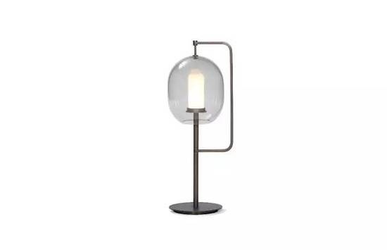
意大利建筑设计师Vico Magistretti在1977年设计了名为Lyndon的系列灯具,采用线条简单的灯柱和球形的光源,形成有趣的对比,整只灯有如一朵发光的云彩。在Vico Magistretti逝世十周年之际,如恩特别设计了“灯笼”系列灯具,向Lyndon灯致敬。
Vico Magistretti designed a light in 1977 called lyndon with the idea of a structure holding a simple ball of light. The minimal approach to its support is contrasted with the delicate glass bowl with the idea of it reading like a cloud. To commentate the tenth year of his death, we selected the lyndon light to pay homage and created a light with the same spirit in mind.
“灯笼”灯的设计灵感源自光的精髓; 就像光的最早形式——火炬一样。在暗色玻璃罩保护下的光源置于柱状支撑结构的顶端,强调了光源本身,散发出柔和的光芒。
In our everyday existence, light serves us by enhancing everything around it, while it itself is often neglected. Here, the inspiration comes from the quintessential source of light; like its ancient predecessor, the fiery torch, this design consists simply of an upright rod with an illuminated tip. Celebrating the glorious spectacle of light itself, the tinted glass shade is a modest attachment that branches off the main support to gently shield its centerpiece.
NERI&HU X REALLY
HALL 20, STAND F18
长凳与矮凳
BENCH & STOOLS
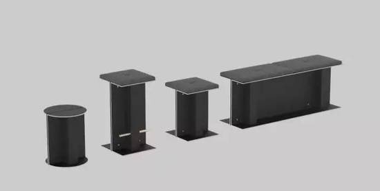
Really是一家丹麦创业公司,致力于应对全球性的废物再利用的可持续发展,最近被Kvadrat收购。今年米兰设计周推出了从纺织废料循环利用而成的坚固复合板,名为 “Solid Textile Board”。如恩为Kvadrat展厅设计的长凳和两款矮凳就采用了这种新型材料作为底部结构,每只凳子都配有Kvdrat面料制成的坐垫。受到建筑构造的启发,支座C形板背对背组合构成,并由黄铜螺栓连接固定,最终构成I形的柱体。复合板采用深灰色由背靠背的C形平面构成,黄铜螺栓可将部件连结,形成I形的圆柱或长柱。复合板本身为深灰色,侧切面则呈现白色,暴露出夹层中的复合材料,展示出再利用材料兼具优雅与环保的可能性。
Really, the Danish sustainability start-up initiated as a response to the urgent global issue ofwaste, was recently acquired by Kvadrat. Really is launching Solid Textile Board in Milan this year.Within Kvadrat’s stand, Neri&Hu’s design for a bench and two stools features the new materialas a structural base, each topped with a padded cushion using Kvadrat’s signature textiles.Taking cues from architectural tectonics, the base consists of back-to-back C-shaped planes, when joined together with brass bolts, form the I-shape of structural columns and beams. The boards themselves are dark gray, while the end profiles are highlighted in white and exhibit the sandwiched composition of REALLY, to showcase that material reuse solutions can be elegant as well as eco-friendly.
NERI&HU X OFFECCT
HALL 20, STAND F28
衣架
THE HANGER
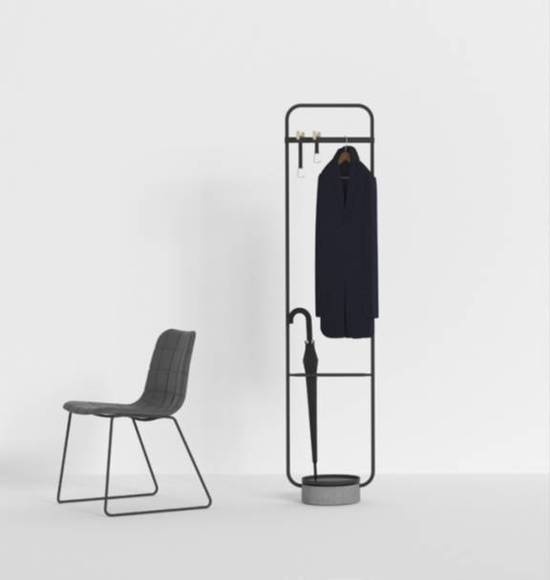
如恩设计的此款衣架秉承了瑞典家具品牌OFFECCT一贯对可持续性和功能性的重视。衣架采用简洁现代的形式,表达出对朴素而平凡的多功能家具的敬意。这些家具就像服务生一样,不企求受人注意,但通过发挥本身的作用为人们带来优雅、美丽和实用的居家生活。
Neri&Hu approached the design for this piece with Offecct’s ethos on sustainability and functionality in mind. The coat hanging structure is a celebration of the unadorned nondescript multipurpose furniture in its simplest and modest form. Like a servant, it does not crave for attention but in its utilitarian approach brings grace, beauty and usefulness to a household.
衣架U盘
THE HANGER USB
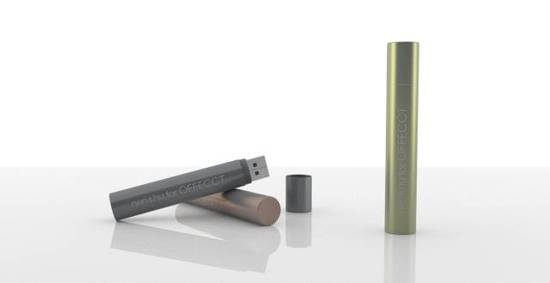
2017年,如恩借鉴了为OFFECCT设计的衣架外形,特别设计了一只合作款USB,也将在米兰展中展出。
Neri&Hu designed the USB stick this year to resemble a section of the Neri&Hu hanger piece that is part of the offect collection.
NERI&HU X POLTRONA FRAU
HALL 20, STAND C01-F06
“配角” 家具衍生系列
SUPPORTING REN EXTENSION
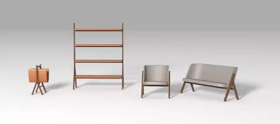
此家具系列的名字基于汉语中的“人”字。从语言本身甲骨文的源构造来看,简单的两个笔划构成了人类的形象。稍长的一笔轻柔地倾斜着,由稍短而粗的另一笔稳固地支撑着——两者相互依靠以保持稳定,形象地展现了本系列家具的构成特征。每件家具主要由两个“人”形木质结构支撑,以同为木质的次级结构相连结。置于其上的是厚软的皮革,曲线轮廓使其更显柔和,而黄铜细节则为之增添了一分奢华。衍生部分为“配角”系列增加了一张椅子、一张双人沙发、一个书架、一个杂志架以及一面台镜。这个系列不仅发挥了其配件的功能,同时也呈现出室内的空间布局。
The collection’s name refers to the Chinese character “ren” which means people. Since the very inception of the language itself, appearing in oracle bone inscriptions, the two simple strokes are a pictographic representation of the human figure. The longer stroke leans over gently while the thickened short stroke forms a steady base to support the other—one could say that the two depend on each other for stability, which is exactly the tectonic expression of parts that is featured in each item of the collection. Every piece consists of two “ren” forming the main structure in wood, carrying between them the secondary structures, also in wood. Functional elements sitting atop are softer with curvilinear contours, wrapped in rich leather, while bronze details add a touch of luxury to the design. The extension to Supporting Ren series adds a Chair, Love Seat, Bookshelf, Magazine Rack, and Table Mirror to the collection. Going beyond the accessories category, these pieces not only provide functionality, but also begin to define the space of a room.
NERI&HU X STELLAR WORKS
OFFICINA, VIA TORTONA 31
“普通话” 系列家具
MANDARIN COLLECTION
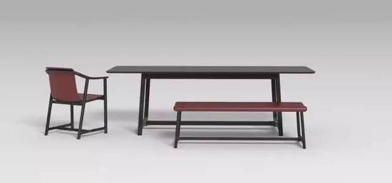
如恩设计的“普通话”系列家具致敬了二十世纪三十年代上海的装饰艺术风潮,其建筑遗产在上海很多地方仍很常见。受到那个时期东西双方意识形态的独特融合,家具的结构融合了中国传统木工手艺所诠释的细木工手艺和结构,但同时打破了传统皇室家具的直立坚硬椅背和平滑的座位。官僚系列的皮质元素呈现缓和的曲线线条;也可以说是源于现代家具的奠基石——世纪中叶对成型胶合板的启发。因此这个系列既富有明显的当代外观和质感,又流露出与历史和文化的关联。
Neri&Hu’s design for the Mandarin series pays homage to the Art Deco influence on Shanghai in the 1930s, whose architectural legacy is still found in many parts of the city today. Inspired by the unique confluence of Western and Eastern ideologies during that time, the structure of the pieces takes cues from the expressed joinery and hierarchy of Chinese carpentry, but at the same time, breaks the rigidity of traditional imperial furniture with upright stiff backs and flat seats. The leather elements in the Mandarin series are shaped in gentle curving lines; they can be said to have roots in the mid-century experimentations with molded plywood that are a cornerstone of Modern furniture. As a result, the pieces have an unmistakably contemporary look and feel, while harkening a sense of connection to history and culture.
新版 "外滩" 系列家具
BUND REVISED COLLECTION
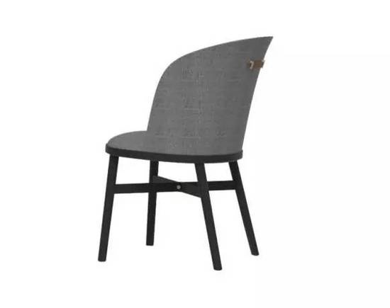
受外滩——上海过去、现在及未来的代表的启发,该系列家具将其工业发源地和繁盛的殖民历史元素相结合。曲线柔软,皮质与布料光洁,木质椅凳致敬了注入这座城市DNA留下永恒的装饰艺术风格。同时,附在椅座上的精确切割的金属部件将整个家居组合起来成为整体。
Inspired by the Bund, a lasting symbol Shanghai’s past, present, and future, this series combines elements not only from its industrial origins, but also from its splendid colonial history. The soft curves and rich leather and fabric finishes, as well as the wooden legs pay homage to the Art Deco style which is permanently ingrained in the DNA of the city. Meanwhile, it is the precision machined metal parts which attach base to seat that brings the whole piece together as a unified whole.
三角桌
TRIPOD TABLES
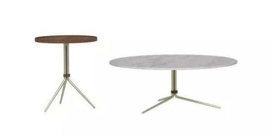
基于如恩的建筑背景,如恩设计的这系列桌子表现了可能是最简单却有效的构造之一的结构。三角形是人类所知道的最坚固的形状,三角形的结构能减少横向运动从而增加强度。三个桌腿分担了同样的重量,由一条皮带固定在一起,形成了对顶部多个不同桌面的极稳固支撑。桌面的材料、大小各异,从桌腿向不同角度和范围延展,巧妙的展现了这个载物的概念。同时,三角桌锥形桌腿和微妙的比例让它们的结构功能看上去别具优雅。
Drawing from their architectural backgrounds, Neri&Hu have designed a series of tables that celebrates one of the most simple, yet effective, structural configurations possible. A triangular form is the most rigid known to man, triangulation of material adds strength by reducing lateral movement. Each of the three legs shares the structural burden equally, bound together by a leather strap, they form an incredibly stable support for the various table tops above. The table tops vary not only in material but size, and each results in a different angle and spread of the legs, to aptly reflect the notion of carrying a load. At the same time, the tapered legs and delicate proportions of the Tripod Tables make their structural function look effortlessly graceful.
NERI&HU X VIABIZZUNO
VIA SOLFERINO 18
SUL SOLE VA 吊灯
SUL SOLE VA
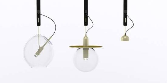
灯点亮了我们的日常生活,而灯本身则往往被我们忽视。在这款设计中,如恩将关注的焦点还给了灯源本身,纵使脆弱易碎,但仍旧被我们视作无价而珍贵的元素。通过严谨精密的设计和工艺,精细的电线和灯泡由皮质挂带和铜勾稳固地悬挂起来,由透明玻璃外壳笼罩的灯源散发出熠熠光辉。
In our everyday existence, light serves us by enhancing everything around it, while it itself is often neglected. Here, the attention is given back to the source of light, treating it as an invaluably precious, albeit fragile, element. With its delicate wiring and bulb exposed, it requires the additional armature and structural support of the leather strap and brass hooks, while the glass bulb cocoons around and protects its gentle glow.
展位空间设计 INSTALLATION
NERI&HU X KVADRAT
HALL 20, STAND F18
KVADRAT 展示空间设计
THE EXPOSED CUT
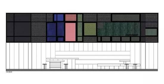
2017年,如恩为Kvadrat设计的米兰展展位空间采用了暴露式的支架结构,刻意反转了去年为同品牌设计的空间概念,向传统的展位设计提出质疑——精致无暇的表面背后往往隐藏着脆弱的临时性结构。如恩选择了将内部结构展露在外,使得这只由织物包裹的漂浮着的盒子不仅能够让人们从内部收获体验,在外部具有观赏的趣味。漂浮的盒子由Kvadrat品牌的织物包覆,做工细致,展示出优良的品质。地面平台采用橡木,在展位内的不同区域或抬起或下降,与头顶的盒子交相呼应,将不同的功能区域划分开来,其中面积最大的平台能够供人们坐下休息,营造出家一般的友好环境,让人们在忙碌繁杂的展会上收获片刻宁静。
For 2017, Neri&Hu inverts their own design of the booth from last year’s fair by featuring an exposed scaffolding structure. Questioning the typical construction at fairs—the vulnerability and temporality of structures behind their polished and impeccable frontages—Neri&Hu chooses instead to reveal and celebrate the underlying framework within. This allows the fabric boxes floating above to not only be experienced from within, but also viewed from outside; clad in textiles equally beautifully woven on both front and back sides, it was also an opportunity to showcase the high quality of Kvadrat fabrics. With an oak platform as the base, various areas rise and fall to interact with the boxes overhead and to define distinct zones and functions. The largest platform offers a democratic and welcoming place to sit and observe, a sublime moment of tranquility within the chaos of the fair.
NERI&HU X STELLAR WORKS
OFFICINA, VIA TORTONA 31
“窥视者”展厅
THE VOYEUR
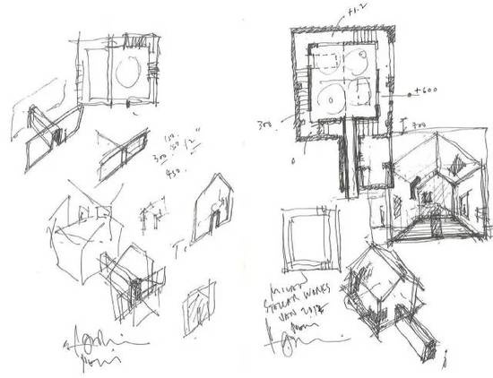
郭锡恩手稿 Sketch by Lyndon Neri
2017年,如恩为Stellar Works所设计的展位回归了家的概念,家不仅是我们放置最珍贵物品的容器,也是我们内心深处执念、好奇心和梦想的精神归宿。展位引入了一个“房子”的原型,将精心策划路径置于其中。延长的入口引导参观者缓慢离开外部繁忙的世界,营造了极其深邃的内部感。进入展位里面,空间氛围明亮且宁静,各系列家具的摆放营造出安静的亲切感。一扇隐蔽的门将参观者带入另一条较暗的通道,在房子与原有建筑的外壳之间。沿着通道向上或环绕而行,参观者能从独特的角度观赏家具,将看似平淡的家居场景变成了一次奇妙又愉悦的旅程。
For 2017, Neri&Hu’s design of the Stellar Works booth revisits the notion of
domesticity, where the home is not only a container for our most precious objects, but also a journey through the psyche—our innermost obsessions, curiosities, and dreams. The design intervention inserts an archetypal “house” into the space with a curated path. Upon entering, a prolonged procession guides visitors gently away from the hectic world outside and establishes a deep sense of interiority. Once within, the atmosphere is light and calm, furniture collections placed with a quiet sense of familiarity. Through a discreet opening, a darker secondary path is nestled between the house and the existing building shell. Ascending upwards and around, various openings along the way reveal furniture pieces to be viewed from unconventional angles, transforming the seemingly banal domestic scene into a journey of wonder and delight.
展览 EXHIBITION
NERI&HU X LEXUS DESIGN AWARDS
VIA LE ALEMAGNA 6
时间:4月3日早10点半至晚10点
TIME: 10:30 - 20:00 APRIL 3RD

雷克萨斯设计大奖设立于2013年,旨在发掘世界各地的创意新人。大奖通过鼓励发掘对社会有贡献的创新思维,赞助参赛设计师们用他们的作品塑造一个更美好的未来。自2014年起担任设计导师的郭锡恩先生胡如珊女士也将于米兰出席2017雷克萨斯设计大奖的最终评选和颁奖活动。
Lexus Design Awards was launched in 2013. It is an international design competition that targets up-and-coming creators from around the world. The award seeks to foster the growth of ideas that contribute to society by supporting designers and creators whose works can help to shape a better future. As the mentors since 2014, Lyndon Neri and Rossana Hu will be present at Lexus Design Award 2017 in Milan.
NERI&HU X INTERNI
HALL DELL’AULA MAGNA
“洞见万物”展
MATRIX EXHIBITION
演讲 TALK
NERI&HU X FRAME
ROOM MATE GIULIA VIA SILVIO PELLICO 4
郭锡恩先生演讲
LYNDON NERI’S TALK
家在别处
JOURNEY HOME TO THE UNFAMILIAR

时间:4月5日晚6点至7点
地点:ROOM MATE HOTEL
VIA SILVIL PELLICO 4
TIME: 18:00 - 19:00 APRIL 5TH
VENUE: ROOM MATE HOTEL
VIA SILVIL PELLICO 4
相关知识
2017米兰设计周 | 发现如恩
发现如恩 | 2017米兰设计周
“世界的生活家”设计文化交流系列活动将于2017米兰设计周启行!
“世界的生活家” 设计文化交流系列活动将于2017米兰设计周启行!
2017米兰设计周 | 瞿广慈专栏:心怀初衷,走进故城
路易威登花瓣座凳米兰设计周华美绽放
发现如恩 | 2018米兰设计周
2017年米兰设计周色彩流行趋势TOP12
曲美携“如是”系列惊艳米兰设计周 演绎古典美
2017年米兰设计周造型趋势TOP8